
MIXING HIGH + LOW IN OUR GUEST BATH
One of my favorite spaces in our whole house is the bathroom upstairs in our guest suite. We put this room and the adjoining bedroom in years back to be a calm space away from the rest of the house when our friends and family were in town. Though it was meant to be for out-of-town guests, we used this as our main shower for about a month back in the fall while our primary shower was being gutted and I absolutely loved being able to use this space myself. I recently shared a few pics on Instagram and got so many questions, I thought I’d share some details here.
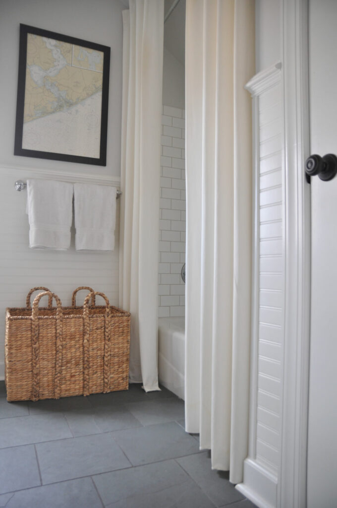
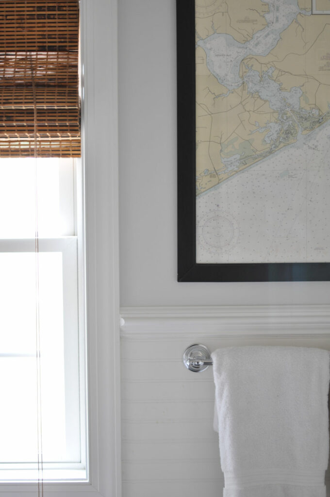
My thought for this room was to keep it bright and airy with cool gray blues, crisp whites, slate floors and lots of texture. When we built the house, we had the upstairs roughed for plumbing and electric, so it was a blank slate when it came time to add the en suite. Naturally, we were working within a budget, but classic materials, neutral paint colors and soft linens helped to create a luxurious feel, which was exactly what I wanted my guests to feel. A cast iron Kohler tub, beautiful Montauk slate floors and a pedestal sink were my must-haves, paired with chrome hardware, crisp white trim and beadboard (Sherwin Williams Extra White), Benjamin Moore Horizon on the walls, Levolor Bamboo Roman Blinds in Tatami to add warmth and contrast (see links at end of post):
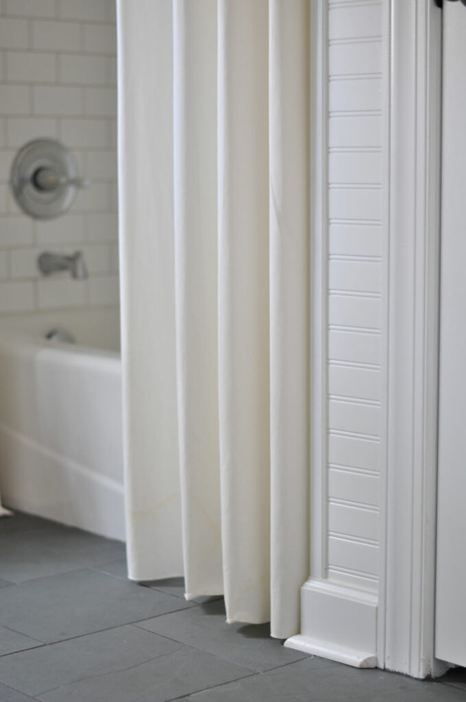
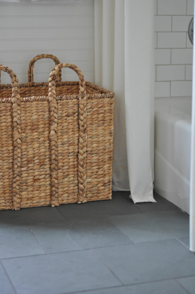
I also hung two separate shower curtain rods – one as high as I could go with a stall liner and another above it, all the way to the ceiling to hang a pair of Merete Grommet curtains in Bleached. It’s such a great way to add a little drama and softness to any bathroom!
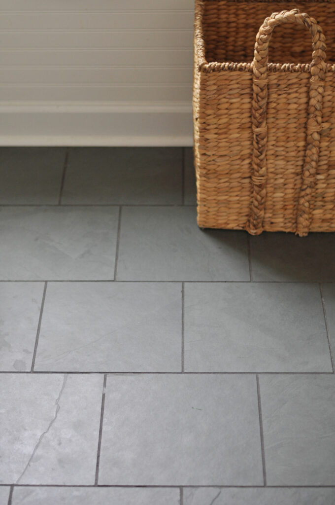
The floors are my absolute favorite; I have them in the primary bathroom and laundry room, as well and they add so much texture and interest, plus I love the contrast against the white bead board. I looked at so many different slate tiles when we were putting this room together but nothing compared to the Montauk Blue slate I ended up going with from Home Depot.
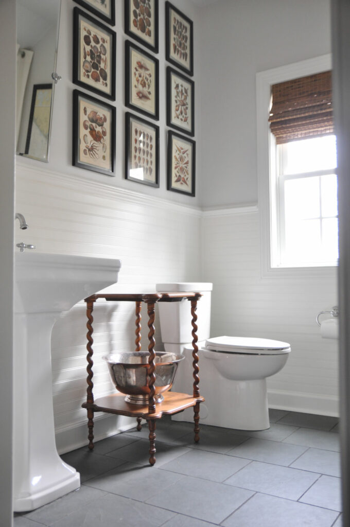
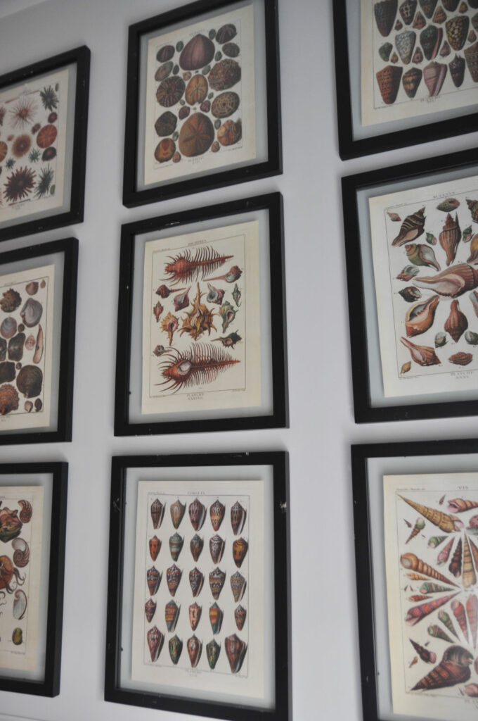
To personalize the space, I added a nautical chart with pencil markings and nine conchology prints, which are actually pages from a book (read about it here), all in a grid pattern to help fill the space on the left wall. Simple black frames are the perfect pop needed here and the artwork is muted enough to not be overbearing in this space.
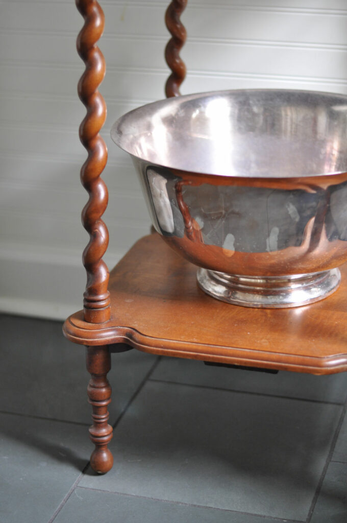
I’ve tried quite a few different tables between the sink and toilet, ultimately settling on this barley twist side table that I found at an antique store years ago. The oversize Revere bowl was also an antique store find and usually holds extra rolled up towels. The wood adds warmth and the silver is such a striking accent in here:
Even though this room is large enough to have accommodated cabinetry, I chose to go with a pedestal sink, instead, and paired it with a Victorian faucet in chrome:
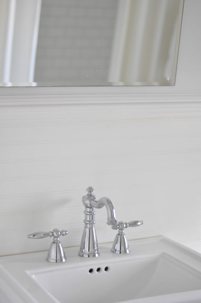
Cast iron tub / Pedestal sink / Victorian faucet / Montauk Blue Slate Floor / Tilting frameless mirror / Double towel bar / Merete Grommet Curtains in Bleached / Extra long stall shower curtain liner / Subway tile / Bead board – SW Extra White / Walls – BM Horizon
Posted in MY HOME

Hello and welcome to Bungalow Blue Interiors!
I'm Kelly, interior designer, stylist, hostess with the mostest and editor of my blog, where I share pics of my work, my own home, décor projects, entertaining hacks, where to find the best decorating deals and all the beautiful things that are currently inspiring me!