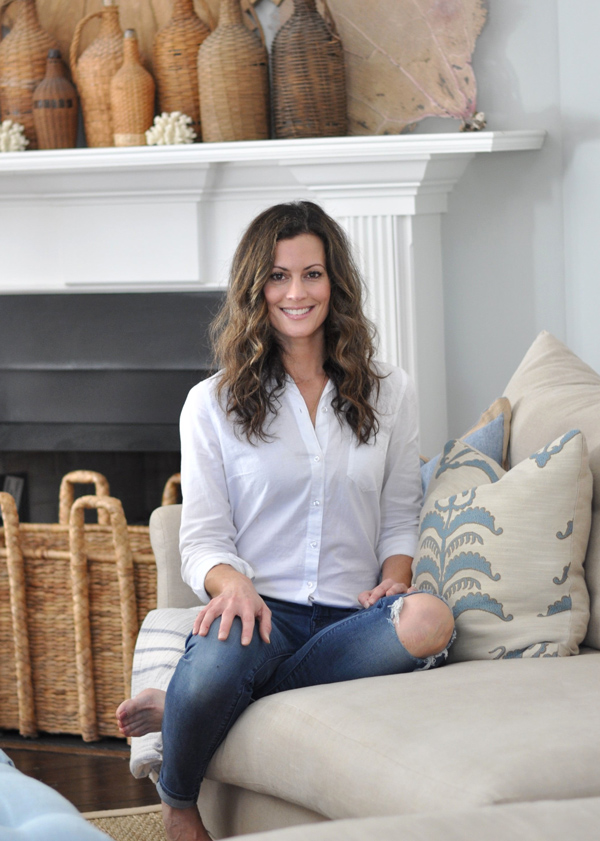
designer love: jackye lanham
When I saw these images of a beach home in Stuart, Florida in Southern Accents magazine a couple years ago, I couldn’t flip through it fast enough to find out who the designer was. (Sorry for the grainy pics-my scanner’s not working, so I took some quick shots of the magazine).


Since then, I think I have almost every one of Atlanta-based interior designer Jackye Lanham’s portfolio pictures in my inspiration folder. Her aesthetic is classic-meets-casual-she creates spaces that are elegant and traditional, yet beckon you to put your feet up and relax. What I love most about Jackye’s work is that, although each one of the homes she designs is different, she returns to the same decorating principles again and again.
This dual-sided kitchen is amazing-the beamed ceilings, iron windows,wide oak floors, marble countertops and black shutters are simply gorgeous. I love how the cabinetry looks like furniture and the lamps add a casual touch:

Here is the other side-those mercury glass lanterns are absolutely stunning! And the generously-sized windows let in so much natural light:

Here is another kitchen that has been a favorite of mine. The floor-to-ceiling cabinetryand the large island are breathtaking. I am absolutely having black shutters in my next house to separate the kitchen from the eating area like shown here. The seaglass bottles add a pop of color and a nautical touch.

A rustic dining room, complete with a wine closet. Love those chairs:

The slate floors in this kitchen provide the perfect contrast against the white cabinetry. The open shelving and table lamps once again make the space feel more casual:

Rooms over the garage are pretty common here in the south, and they usually come with vaulted ceilings that make it difficult to place furniture. Jackye makes the most of a small space in this bedroom with vaulted ceilings by floating the bed in the middle of the room. The iron sconces and door hardware really pop against all the white:

Love the settee and iron windows in this eating area:

Pale gray-green cabinetry looks gorgeous along with marble countertops and backsplash, pewter lighting and silver accesories, but my favorite feature is, actually, the absence of upper cabinets:

I would curl up and read a book in this comfy, cozy sunroom:


Another light, bright kitchen:

To see more of Jackye’s work, click here.
Posted in designer love, INSPIRATION

Hello and welcome to Bungalow Blue Interiors!
I'm Kelly, interior designer, stylist, hostess with the mostest and editor of my blog, where I share pics of my work, my own home, décor projects, entertaining hacks, where to find the best decorating deals and all the beautiful things that are currently inspiring me!

I totally agree with you. I have admired her work for a long time. Even though she doesn't use a lot of color, she more than makes up for it with he use of texture and adding black to the room. I love all of the images you posted.