MAKING MY CASE FOR BLUE SHUTTERS + EXTERIOR DOORS
If you guys follow me on Instagram, you know we were back up in Nantucket last month for another unforgettable family vacation. I’m still working on a recap post, since many of you asked about what to do on the island with littles and the best places to eat, etc., and it’s coming, I promise! In the meantime, though, I’ve got some architectural eye candy from the island that I can’t wait to share!
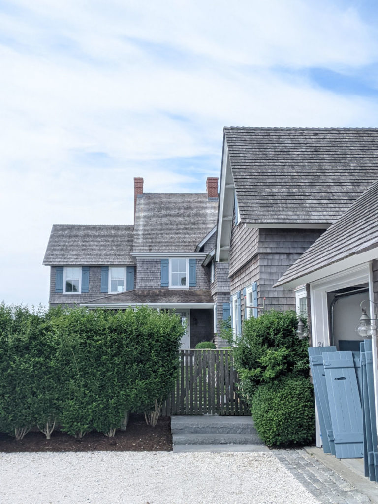
One of the things I noticed constantly this time around was the number of cedar shake houses with gorgeous hydrangea blue shutters and front doors. I was completely enamored by this unexpected color pairing, even though it fits in glorious detail on Nantucket; it’s such a muted color with such soft contrast and it works just beautifully against the cedar shakes! After scrolling through my camera roll a few days into our trip, I realized I had taken quite a few photos of homes with this beautiful color pairing and find myself going back to these snaps a month later, wanting to paint my black shutters and exterior doors hydrangea blue, too! So, you know I have to ask….would you ever paint your shutters and exterior doors blue? Here are a few photos to make my case (and apologies ahead of time because they were all taken with my phone, so they aren’t in as crisp detail as when I use my Nikon!)
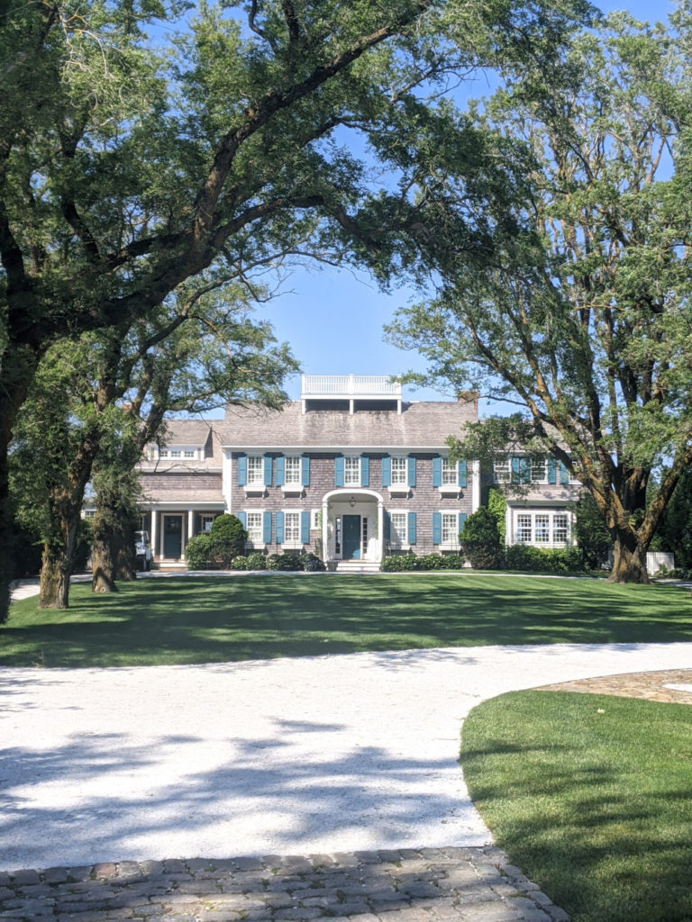
This beauty on Cliff is one of my favorites and the almost-teal shutters and front door, along with the crushed seashell driveway and gorgeous trees, create quite the dramatic first impression, no matter how many times you pass it by!!
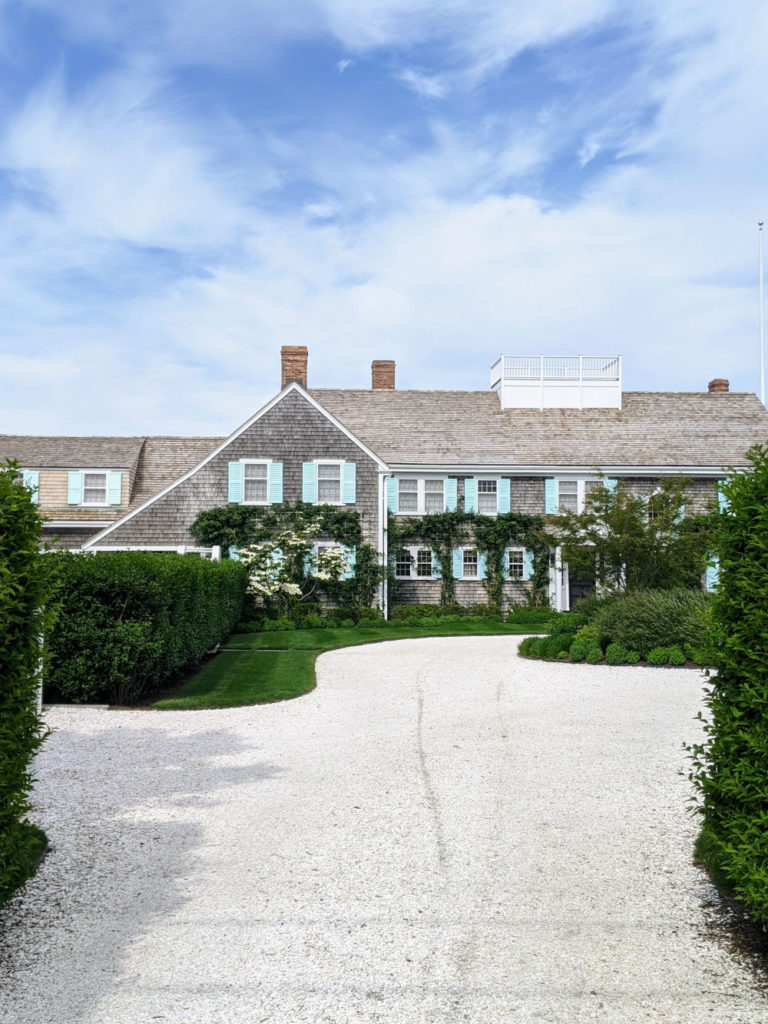
Another favorite is Tommy Hilfiger’s former summer home on Lincoln Circle, right by the entrance to Steps Beach. Those aqua shutters are such an unexpected but gorgeous pop of color and are a beautiful compliment to the climbing roses and hydrangeas when in bloom!
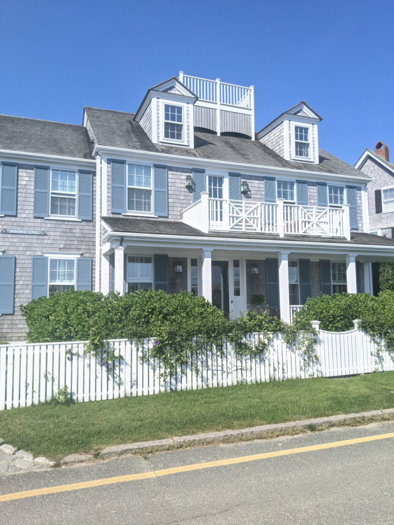
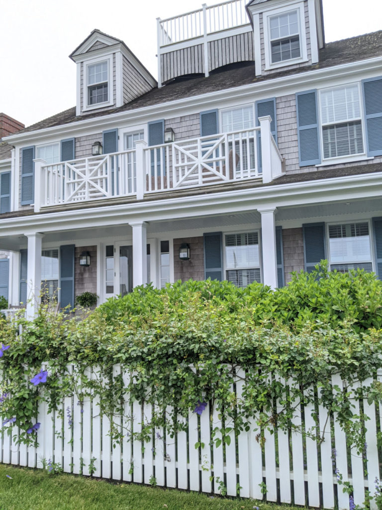
Another beauty on Lincoln that takes curb appeal to a whole new level with its white picket fence covered in climbing roses. I especially love this one because the contrast between the shutter color and the cedar shakes is so incredibly soft and subtle that it lets all the other architectural elements take center stage!
Here it is from the opposite approach:
We walked by this cedar shake stunner on India Street every time we went into town or breakfast at Black Eyed Susan’s and I couldn’t help but snap a photo every time! I love the saturated shade they chose and especially loved that they painted both the front and screen doors as well as the window boxes in the same hue! A total showstopper!
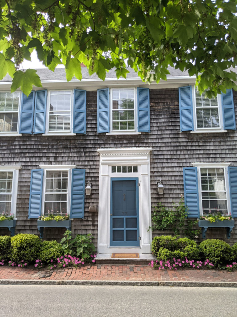
Blue and white is my forever favorite color combination, especially when paired with a brass seashell door knocker and framed by perfectly trimmed privet:
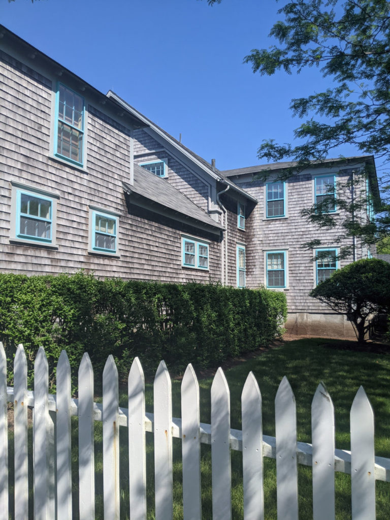
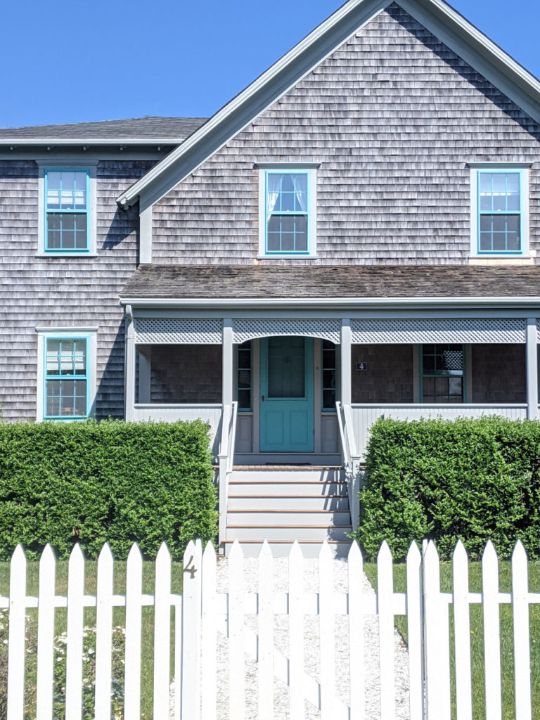
Bright aqua isn’t necessarily a shade I would ever have thought to pair with cedar shakes but it just works so beautifully here, in part because it just covers the window casings and trim. A fresh, modern feel:
Here is the front approach:
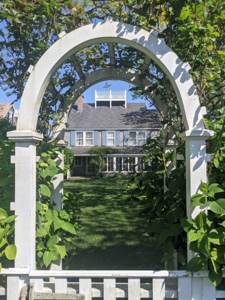
A muted gray/blue is such a lovely compliment to the charming side entrance, thanks to the arbor, climbing vines and widow’s walk:
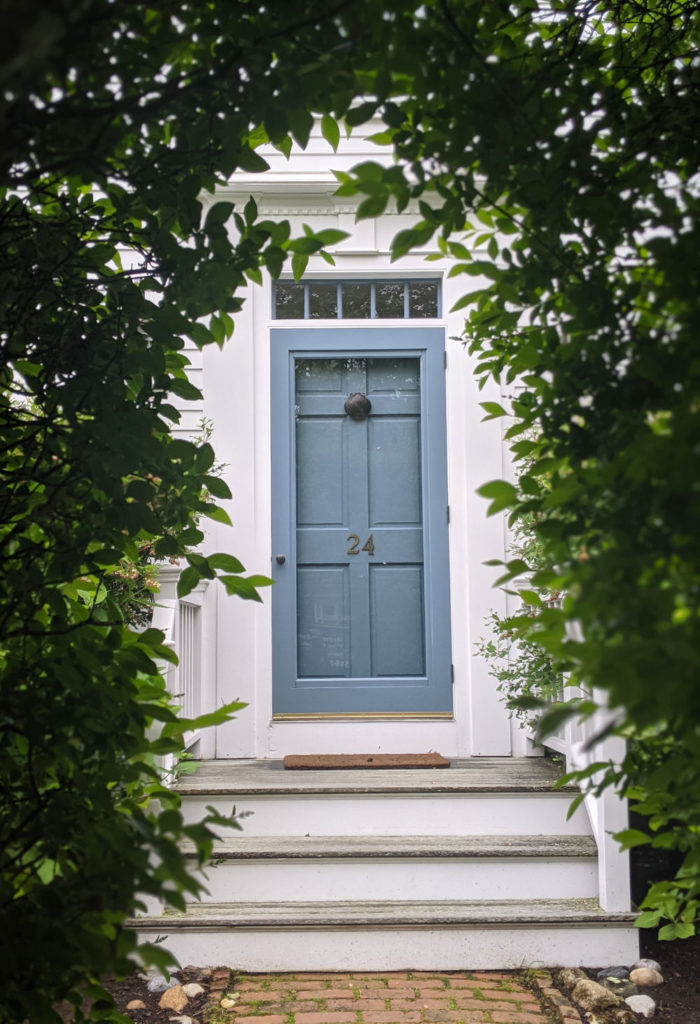
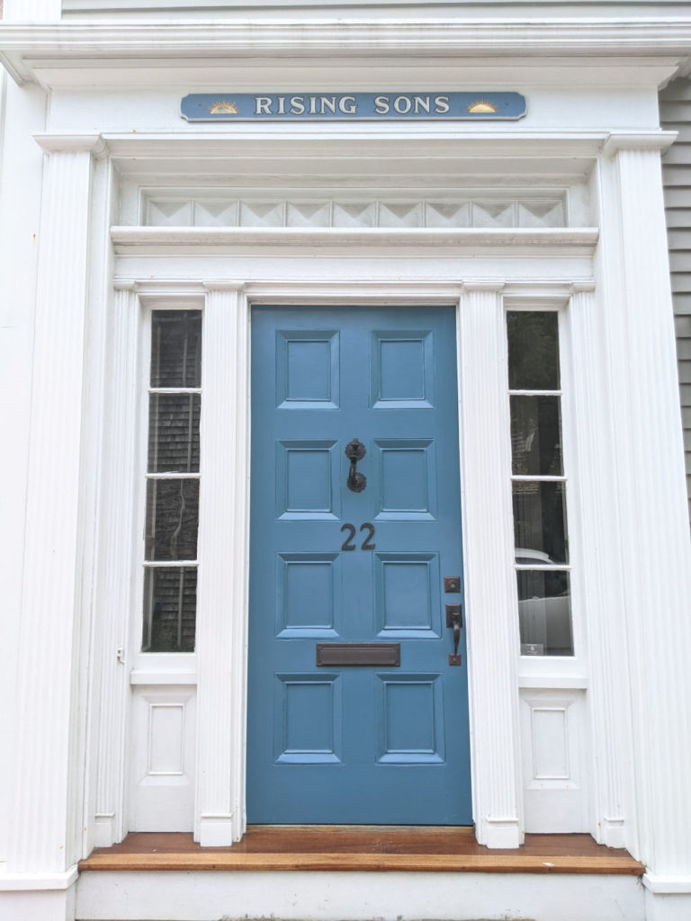
Blue looks even more fresh and crisp against the white clapboard and transoms. I also love how the color matches the house sign!
Cedar shakes as far as the eye can see and yet, I will always seek out the white clapboard – especially one with such lovely-hued shutters!
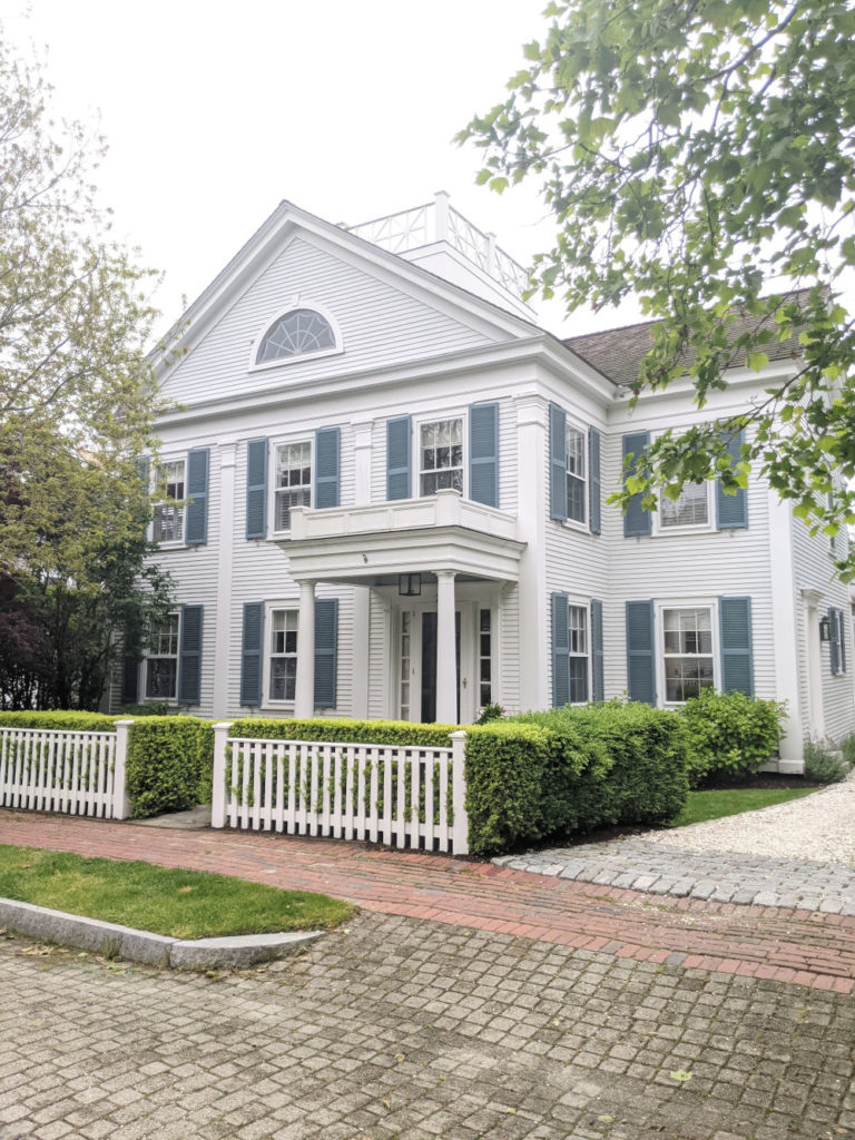
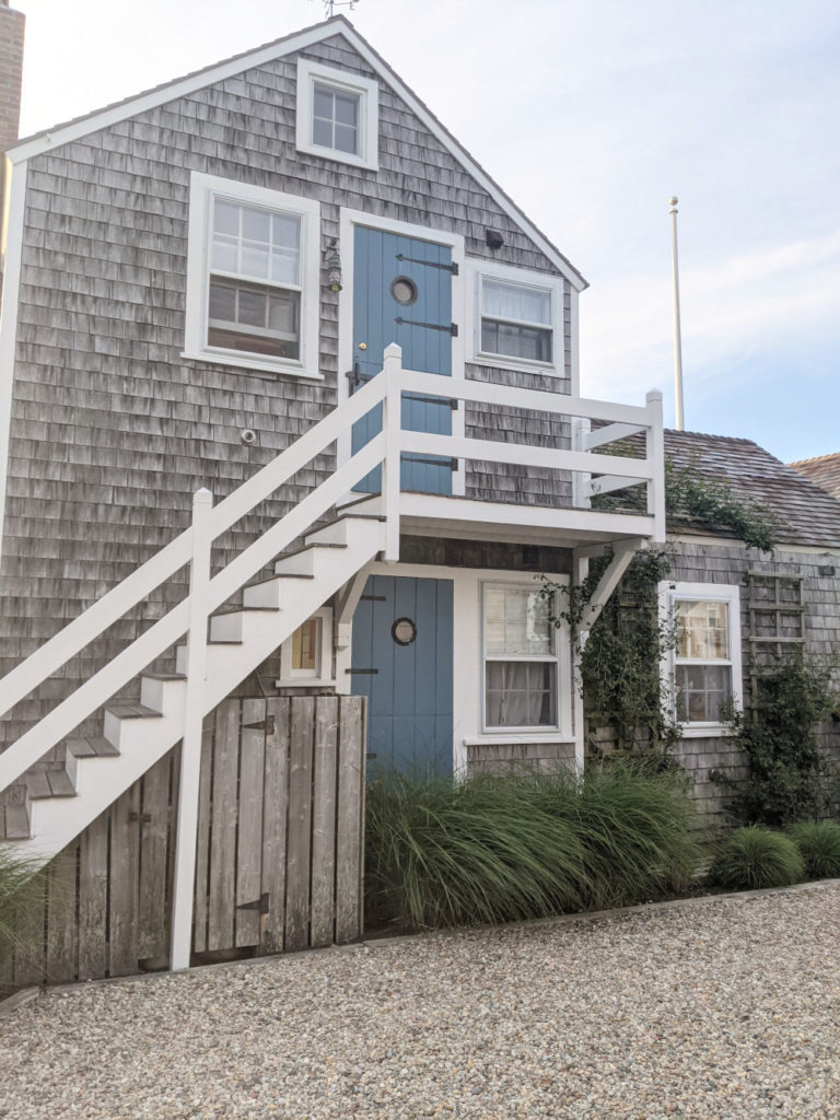
This beauty on Lincoln Circle was getting a fresh coat one day as we were walking to Steps:
So, what do you think? Do you love the blue? Would you ever paint your shutters and exterior doors in this gorgeous hue?
Posted in INSPIRATION
Hello and welcome to Bungalow Blue Interiors!
I'm Kelly, interior designer, stylist, hostess with the mostest and editor of my blog, where I share pics of my work, my own home, décor projects, entertaining hacks, where to find the best decorating deals and all the beautiful things that are currently inspiring me!

I love this color blue on the door of the photo published – the description of the photo is
“Blue looks even more fresh and crisp against the white clapboard and transoms. I also love how the color matches the house sign!” (RISING SONS)
It is the blue door with the #22 on it. Can you tell me the color name?
It’s such a beautiful shade of blue! I wish I knew what the color was, but I snapped the photo in passing by and have no idea, I’m sorry!
Lovely images. We plan to have blue shutters and front door but with a white exterior. In Southern California. I am looking for the “right” blue (and the “right” white too) Thank you so much for this post.
Hi, Carol! I don’t think you could ever go wrong with blue and white. It’s such a timeless color combination!