new hutch is in!
I hope everyone had a great Turkey Day! We spent the long weekend in what felt like food and alcohol-induced comas and it was wonderful to do nothing but spend time with family!
From the time we chose and tweaked the floorplan for our home I knew I wanted a hutch in the breakfast area to make it feel more like an extension of the kitchen. We have vaulted ceilings in both areas and unfortunately, every piece of furniture I considered to refinish seemed dwarfed in the space, so we ended up going custom and we’re so glad we did! We put it up over the weekend, and I love how it turned out! Here are some of the spaces that that got my creative juices flowing when it came time to design my own:
The built-ins from the movie Something’s Gotta Give are my all-time favorite. Clean and classic with beadboard backing and oil rubbed bronze pulls (and that incredible collection of white ironstone!):

South African interior designer John Jacob knows how to style a mean China hutch:

I’ve always loved this charcoal gray built-in from the Coastal Living showhouse a few years back. The hutch ties the dining area and the kitchen together with the same dark gray paint as the cabinets in the kitchen:

Here is another view from the living room, via:

Interior designer Holly Mathis’ dining room is small on space but high on style, thanks to a beautiful built-in which she painted Martha Stewart’s Flagstone. Her white plates really pop against the soft gray paint:

When I first saw this built-in hutch in Southern Living a few months ago, my jaw literally hit the floor. How stunning! The arched doors and antique brass hardware are just perfect:

I love this built-in plate rack in Windsor Smith’s gorgeous white kitchen:

This black beauty, via Atlanta Home Mag is absolutely stunning. It makes me want to paint mine in a glossy onyx. Love the glass doors, too:

Another beautiful distressed black hutch, via Country Living:

More beautiful contrast of white serveware against pale gray, via:

And here is what the hutch looks like. It has changed the entire look of the kitchen:

We ran the beadboard horizontally instead of vertically to match with the rest of the house:


Flush-mount Shaker-style doors on the bottom:

I have a lot of work to do to get this part of the house finished – this hutch is only primed, so I have to paint, decide on a new chandelier, refinish and reupholster dining chairs. Stay tuned to see how everything comes together! Happy Monday!

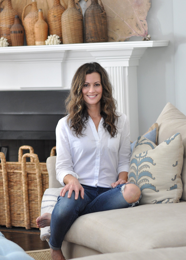
Hello and welcome to Bungalow Blue Interiors!
I'm Kelly, interior designer, stylist, hostess with the mostest and editor of my blog, where I share pics of my work, my own home, décor projects, entertaining hacks, where to find the best decorating deals and all the beautiful things that are currently inspiring me!

OMG – I love it. What a gorgeous addition to a gorgeous room. I love the wall color too!!
Thank you, Karen! Lots to do before it's done, but I'm slowly but surely getting there! 🙂
LOVE it! Cannot wait to see what you do with it!
SO SO pretty! I want to see the whole room!
LOVE THE HUTCH!!!! Just found your blog, and have lost a good thirty minutes scrolling through the beautiful images . . . What a delightful way to start the morning! Happy Designing–Amanda
I LOVE the delicious gray paint color in this room of yours. What color did you use?
So pretty! love the horizontal bead board! great idea!